| StockFetcher Forums · Filter Exchange · Renko Charts | << 1 2 >>Post Follow-up |
| Kevin_in_GA 4,599 posts msg #99943 - Ignore Kevin_in_GA |
3/27/2011 6:30:54 PM Well, since it looks like SF will not be implementing Renko charts in the near future (translation - never), I thought I would post a few examples of how they can be valuable in getting in on the right side of a trend and riding it as far as it goes. The real beauty of the Renko chart format is how clean the signal is - this approach eliminates spurious noise based on the "brick" settings you choose - as long as the price action does not move outside the range that would trigger a new brick, the chart stays the same. Here's a comparison of the standard daily candlestick chart of the Russell 2000 versus a daily and weekly Renko chart for the same time period: Standard Chart: 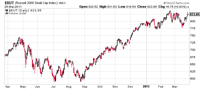
Daily Renko Chart: 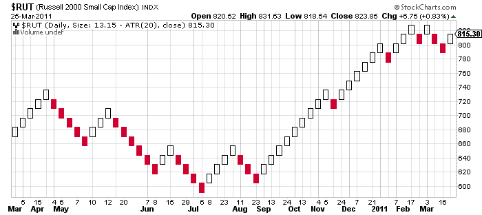
Weekly Renko Chart: 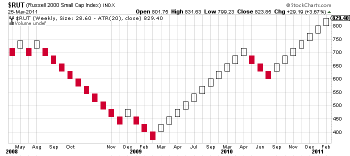
The following charts are in Renko format using a weekly ATR(20) to determine brick size. You can add many of the standard indicators (moving average, RSI, MACD) but to be honest you don't really need them. The entry and exit signals are built into the chart itself - nothing more is needed. In the following examples, you would go long after the formation of the second white brick, and exit after the second red brick is formed. Same thing for shorting - go short after the second red brick and cover at the second white brick. I'll let the charts do the talking: Major indices: 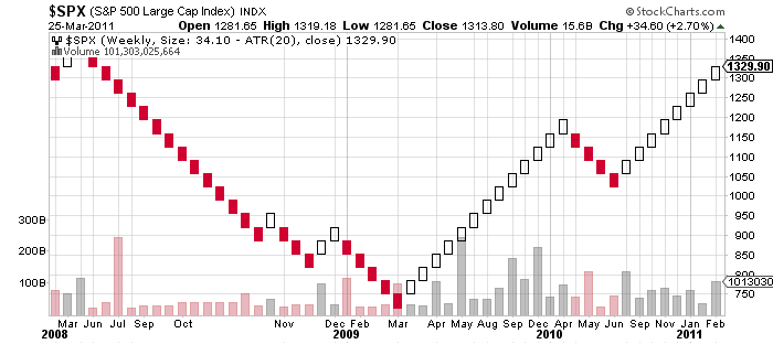
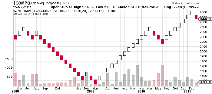

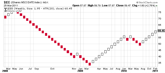
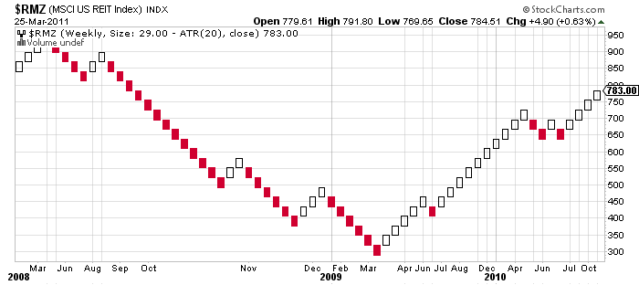
Commodities and Precious Metals: 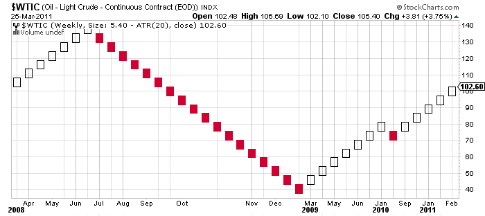
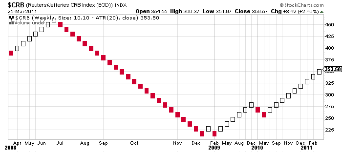
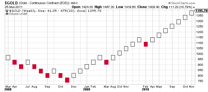
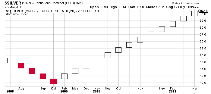
It also works with stocks many here love to trade: 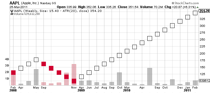
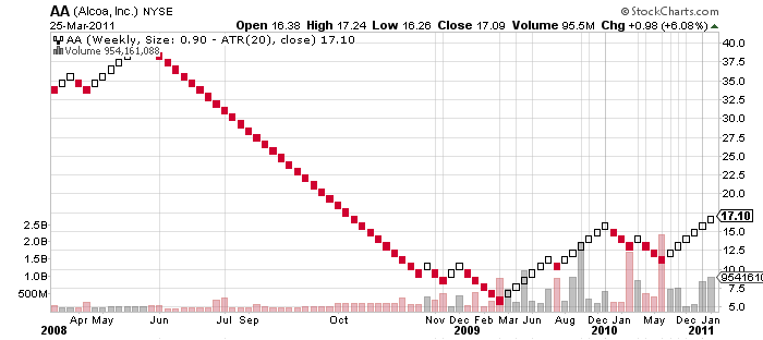
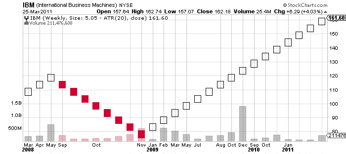
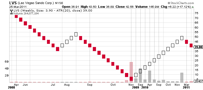
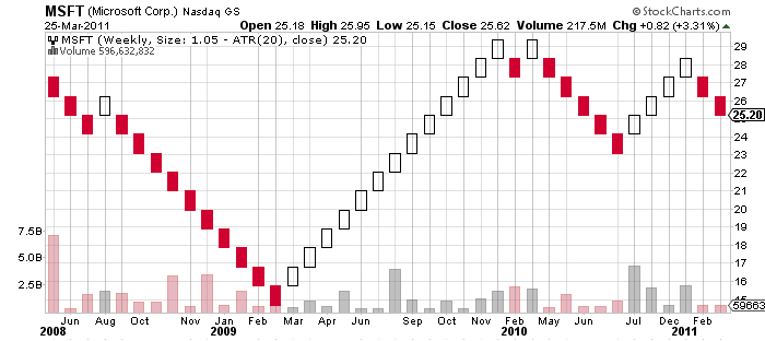
Now I look at the weekly version of the Renko as defining the trend, but also recognize that there will be times when using the same approach on the daily Renko chart will get you in and out profitably. I would suggest using the daily chart for entries and exits but the weekly chart for defining the prevailing trend. Obviously one would not have wanted to go short during the last 6 months or so, as it would have most likely been unprofitable. The downturns on the daily Renko may actually have been better points in which to have "bought the dip". Just my thinking out loud here - this chart style is relatively unknown to most traders, but is wonderful at filtering out extraneous noise and showing you where the overall trend is heading. Honestly, I would love for someone to show me a simpler system than this one. |
| duke56468 683 posts msg #99945 - Ignore duke56468 |
3/27/2011 8:20:49 PM I agree, the renko charts are very helpful in identifying the trend and entry and exit. They are effective in trading the ETF's and inverse ETF's simply adj the Pts (dollar amount) or ATR to reduce the whipsaws and trade what you see. |
| klynn55 747 posts msg #99946 - Ignore klynn55 |
3/27/2011 10:35:28 PM i don't think there is one good book on amazon for the renko, for continuing education, see the ihub discussion boards, there are a few renko boards there. |
| jimvin 179 posts msg #99947 - Ignore jimvin |
3/27/2011 11:18:18 PM Interesting graphic tool for long-term trend trading...I think the Darvas Box overlay is a viable equivalent for short-traders such as myself... |
| oldsmar52 104 posts msg #99969 - Ignore oldsmar52 |
3/28/2011 5:26:22 PM For the weekly chart of Renko, would I use Fridays or would it matter at all which day I use? Thanks for advice, Frank |
| Kevin_in_GA 4,599 posts msg #99970 - Ignore Kevin_in_GA |
3/28/2011 5:35:06 PM It is not really time dependent - the Renko chart only changes when the price action dictates. Need to check on this - I see what you are saying and it makes sense. Since the input data is based on the weekly close, Fridays would be the right day. If a new box were triggered on Tuesday, and by Friday it closes below the trigger, I guess the box goes away? |
| duke56468 683 posts msg #99973 - Ignore duke56468 |
3/28/2011 6:30:42 PM Kevin_in_GA msg #99970 - Ignore Kevin_in_GA 3/28/2011 5:35:06 PM It is not really time dependent - the Renko chart only changes when the price action dictates. Need to check on this - I see what you are saying and it makes sense. Since the input data is based on the weekly close, Fridays would be the right day. If a new box were triggered on Tuesday, and by Friday it closes below the trigger, I guess the box goes away? ################################################################################### Thats true for the daily Renko chart also, the price can vary 1-2 boxes either way but if the daily close is below the threshold the box disappears and if you were not watching you never knew it was there. Once you see the reversal I place an OTO limit order with a stop 2 boxes below on a long. |
| klynn55 747 posts msg #99982 - Ignore klynn55 |
3/29/2011 6:19:07 AM lot of renko stuff here: http://investorshub.advfn.com/boards/board.aspx?board_id=12855 |
| 15minoffame 131 posts msg #99996 - Ignore 15minoffame |
3/30/2011 12:03:56 AM Kevin, Is there a particular reason why you choose to use ATR(20) vs another ATR time period or pts? Thanks, 15 |
| Kevin_in_GA 4,599 posts msg #100000 - Ignore Kevin_in_GA |
3/30/2011 2:19:30 PM Not really - if you use the default setting of ATR(14) it looks pretty much the same. What I am trying to figure out is how one would properly backtest this system. Since the ATR(20) value constantly adjusts with volatility, each bar should be a different size, but clearly they are all the same on these graphs. For example, in December 2009 the Russell 2000 was as low as 400 and the weekly ATR(20) was over 55. It steadily shrunk to as low as 25 by April of 2010, yet in all of the charts one gets using this approach the box size is constant. It seems as though it uses TODAY'S ATR as the brick size for all prior bricks, which is not the same ATR that was occurring at that time. This is deceptive and would clearly lead to an incorrect back test result. I may want to be looking at constant size boxes based on points (or a percentage of the current price if that were an option). If one uses a set number of points you can effectively backtest but lose some of the adaptability of the approach to changing volatility. The constant sixe box approach (e.g., 10 pips) has lots of followers in the Forex world, but not so much in equities. |
| StockFetcher Forums · Filter Exchange · Renko Charts | << 1 2 >>Post Follow-up |